
Microsoft Excel is one of the greatest tools at our disposal when it comes to analyzing huge data sets. One of the more powerful tools I like to use within Excel are Pivot Tables.
A Pivot Table allows you to take literally thousands of rows and hundreds of columns of data and almost instantly identify patterns, trends, and perform a robust analysis. In this post, we’re going to show you How to Create a Pivot Table and how we use them right here on ChartYourTrade.
Getting Ready: Make Sure Your Data is Consistently Formatted
The first step to working with Pivot Tables is to make sure that your data is consistently formatted. What this means is that all of the content you want to analyze in each column is formatted exactly the same. For example, below we have 2 sets of screen shots, one with what we want our data to look like and one that needs to be cleaned up a bit. The column I’d like you to focus on is the “Sector” Column (column D).
Note how in the ‘Inconsistent Data’ screenshot under Sector we see both “Building” and “Buildings”. If we were to run a pivot table on this data set to find out how many stocks are in the “Building” sector, we’d have a miscount because Excel would count up the number of stocks in the “Building” and “Buildings” separately.
Make sure all of the data you wish to analyze is formatted consistently.
Example of What We Want Our Data to Look Like & Results


Example of a Data Set that Needs to be Cleaned Up & Results


Creating a Pivot Table
Now that our data set is consistent, we can create our pivot table. In the screen shots below, we’ll walk you through the how to do it.
Step 1
First, select the “Data” tab which is highlighted by the small red rectangle in the screen shot below. Next select the drop down next to the “pivot table and select “create manual pivot table” which is highlighted within the large red rectangle and red arrow.

Step 2
After selecting “create manual pivot table” you’ll be presented with the following window asking you where you’d like to create your pivot table (new worksheet or existing worksheet). I always prefer to create it in a new worksheet as I find this method cleaner, but please select the option you feel is best. Click “OK”.

Step 3
Next we are presented with the “Pivot Table Builder” (large black/gray box to the right) and this is where we get to select our inputs for the pivot table. As you can see, so far we have selected our Row Labels to be “sectors” and we have already dragged and dropped “sector” again into our “values” box. This time, Excel has defaulted to automatically count the number of stocks in each sector. As you’ll see later on, we can edit this calculation to be something else.
*When analyzing our Universe week to week, its important to monitor the expansion and contraction of the number of stocks in each sector as it highlights strength and weakness. Pivot Tables allows us to do this instantly!
We are also dragging in the “% Chg Cur Week” into our values. We will eventually tell Excel to take the average of each sector to further highlight strength/weakness among the sectors.

Step 4
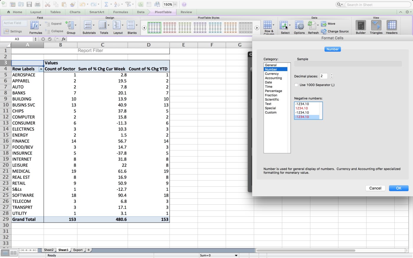
Excel doesn’t always automatically give us the calculation or layout we want. In the screen shot below we see a “sum of % chg cur week” and a “count of % change YTD” in the pivot table.
To edit this, go to the “pivot table builder” (large black/gray box to the right) and click on the “i” in the values box of the value you wish to change. In this example we’re starting with changing the “sum of % chg cur week”. We are presented with a window that lets us edit the calculation. We’ll select “average” and then click okay.

To help highlight positive and negative values, we’d like Excel to highlight negative values in red. To do this, we go to the “PivotTable Field” and click “number”.
Once we select “number” we’ll be given some formatting options. Here’s where it can get a little tricky. We are working with percentages but we do not want to select the percentage format in this instance. The reason is because the values in our original data set are already percentages and if we tell Excel to format our values into percentages, it will treat our current values as whole numbers. Thus what should be 10% will turn into 1,000%. For that reason, it is best to select the “Number” format.
As mentioned earlier, we also want to show negative values in red so we select that from the options below to the right and click okay.
Step 5... WE’RE DONE!
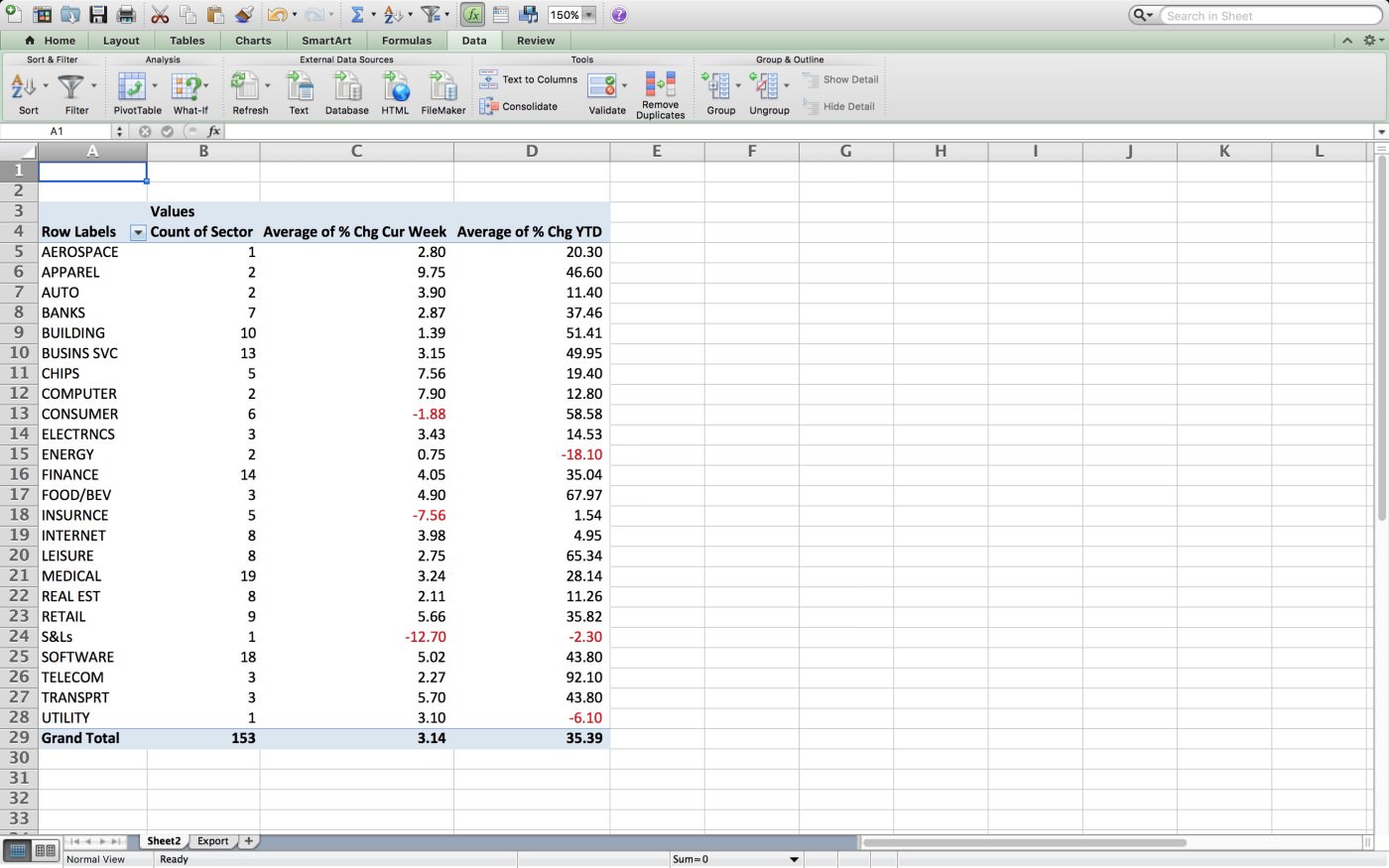
That’s it, we’re done! We are now ready to begin analyzing the information that the pivot table is giving us. Here is an example of some of the points we can extract:
- There are 153 stocks in our Universe
- The largest sector is the Medical sector with 19 stocks in it
- On average, stocks in the Universe rose +3.14% for the week and +35.39% year to date
- The top performing sector with 10 stocks or greater is presently the Building Sector
- There are plenty more points we can extract from this pivot table…how many can you find?
Have a question? We’d love to help! Please leave a comment below…